

We’ve given FZM a bit of an update in terms of look and feel.
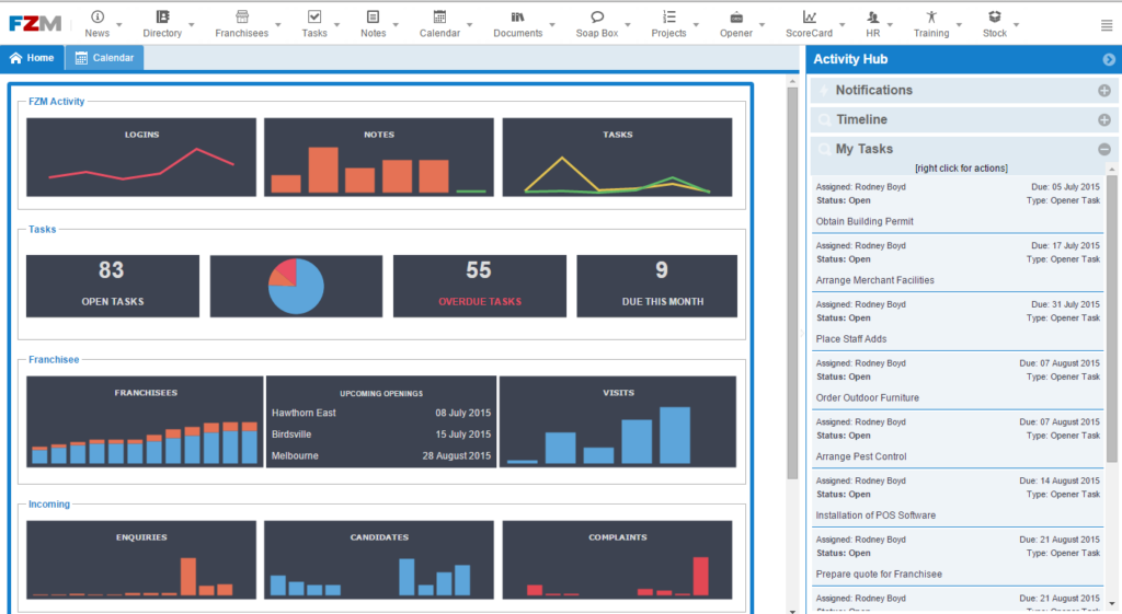
Part of the new look of our franchise software. Flat icons all the way.
There has been a bit of a movement towards ‘flat’ design in software and hatchit is fan of the benefits. The general objective is to take some the ‘eye candy’ (3D effects and colours) out of the navigational elements and go for a more restrained look that allows the content to take precedence on the page and doesn’t take your attention away from what is important (which should be the info you are putting in the FZM system).
So many of the 3D and colourful icons have been replaced with flat design and monochrome colours. Where colours have been used we have tried to make it meaningful. So green icons representing “doing something” (like creating a record) and blue icons representing “viewing something” etc.
There is still some more to come, such as colour coding some of the modules. We have put a lot of thought into the design and we believe that once you’re used to it you will reap the rewards, we hope you enjoy it.